Portrait
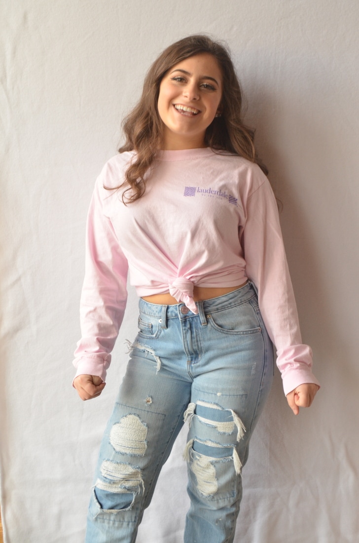

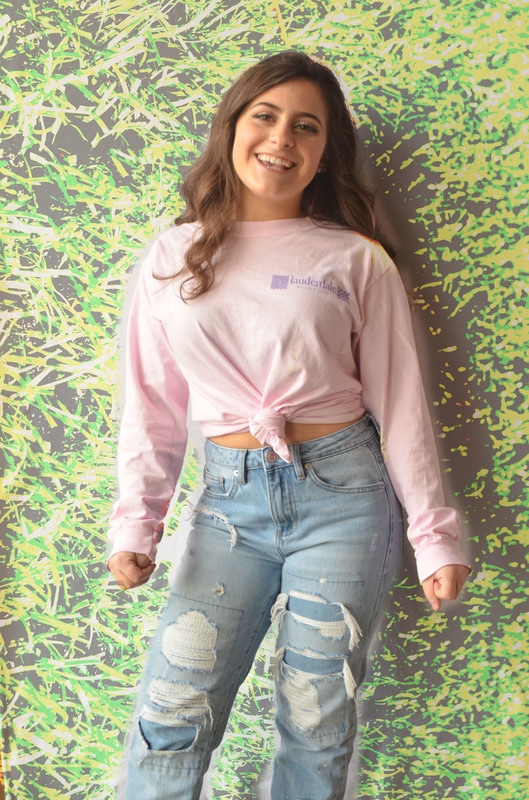
Pic 1: Picture one is different compared to other pictures do to its unique lighting balance. Most pictures are just taken with a flash on and then edited so make it look satisfying. But this picture took different angles of light, along with a back drop that compliments Kara's clothing colors. For the lighting, we placed a light shining to the left of Kara to make her really stick out. We didn't want too much of a shadow so we angled it just right so the only shadow you can see is behind her. The mood of this picture is it creates a very happy feeling and its very relaxing to look at due to the color balance in the picture. To heighten the mood, we could've tried to remove the shadow completely to make it look more professional .
Pic 2: Picture two is also different compared to other pictures do to its unique lighting balance. Kara was wearing very neutral colors this day so we wanted to make her black really stick out in the photo but also provide light to focus on her face. To do this we angled the light at Kara to the right of her and had her look towards that direction to create an effect of her looking off at something. The feeling of this photo is a very dark and mysterious mood, and it creates curiosity by creating an effect of wondering what might Kara be looking at. To heighten the mood of this picture, we could've had Kara make more of a facial expression to give the audience a sense of what it might be exactly that she is looking at.
Pic 2: Picture two is also different compared to other pictures do to its unique lighting balance. Kara was wearing very neutral colors this day so we wanted to make her black really stick out in the photo but also provide light to focus on her face. To do this we angled the light at Kara to the right of her and had her look towards that direction to create an effect of her looking off at something. The feeling of this photo is a very dark and mysterious mood, and it creates curiosity by creating an effect of wondering what might Kara be looking at. To heighten the mood of this picture, we could've had Kara make more of a facial expression to give the audience a sense of what it might be exactly that she is looking at.
Portfolio
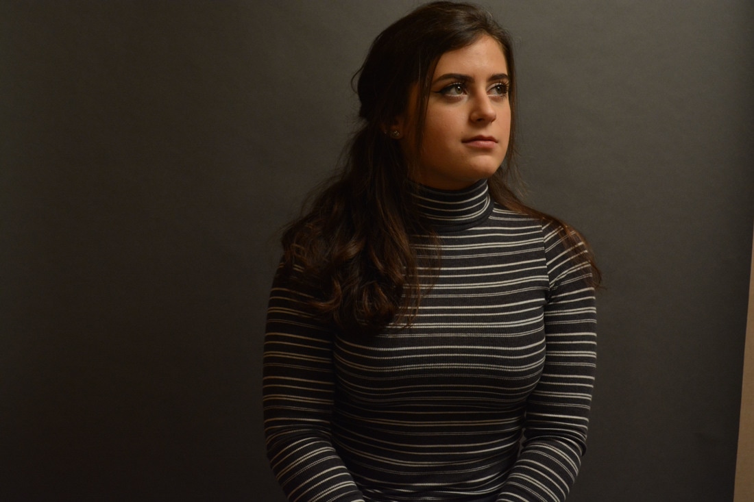

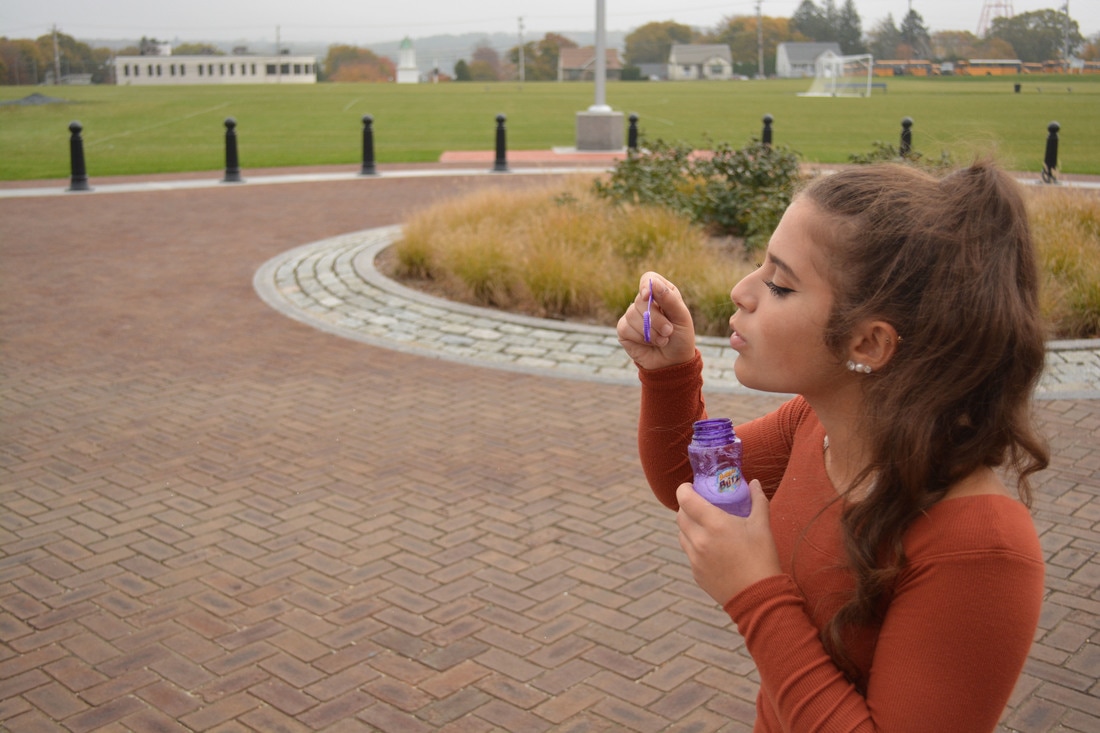


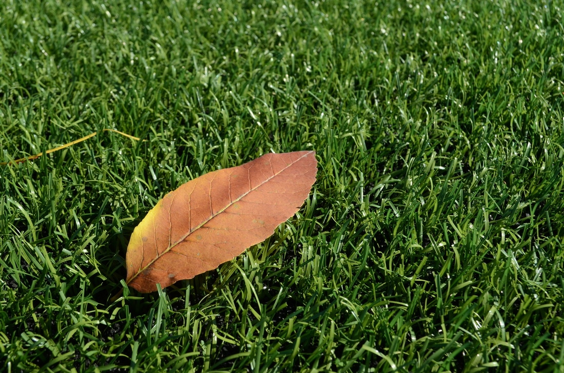
Image 1: I chose this image because the back drop really went well with Karas shirt and it gave a nice shadow and light source. This image is compositionally dynamic because we were doing self portrait pictures and had to use a light source and on the left you can see how its brighter compared to the right where its darker. When looking at this image, you start by glancing at the right and then your eye slowly travels to the left side of her face where it gets darker. To take this picture, we had to make the IOS higher because it was coming out too dark.
Image 2: I chose this image because Karas shirt gave a nice mixture to the back drop which really perfected the image. The image is compositionally dynamic because this as well is a self portrait image and we had to hide some of the light because it was coming out too bright due to the white background and the shirt. While looking at this image, you start to look and see where her eyes are glancing. To take this picture we had to lower the IOS because it was coming out too bright.
Image 3: I chose this image because I like how it shows Kara in the moment of blowing bubbles and it freezes motion. This image is compositionally dynamic because I used the rule of 3rds and kept her out of the middle of the picture and slightly to the right. While looking at this image, you look to see if you can see any bubbles and then slowly realize the nice background behind her. To take this picture, I had to make the shutter speed shut at a faster rate which froze the motion of the bubbles.
Image 4: I chose this image because it was one of our first assignments and I really liked it because it was on of my first pictures. It is compositionally dynamic because I had a slight blur of the front of the keyboard where as to the back of the keyboard is more focused. While looking at this image you will see the clear keys first and see the focused part. I had to decrease the depth of field so it focused more on the back of the keyboard.
Image 5: I chose this image because I was just taking pictures during the texture assignment and just happened to take this one because why not. It is compositionally dynamic because I used the rule of 3rds instead of centering the bell tower I put it to the right to perfect the image. You eyes will travel all over the image seeing all of it and just enjoying the image but the bell tower to me is what I notice the most. To take this picture i had to really focus it and zoom in and out to get the right shot.
Image 6: I chose this image because we were doing a texture assignment and I thought this image really showed nice texture balances. It is compositionally dynamic because it fits the texture assignment and shows the textures of the turf and leaf. You will first notice the leaf sitting on the turf and then see all the turf strands sticking out. To take this picture, I had to get very close and really focus it on the turf and leaf by making the appeture lower and depth of field lower.
Double Exposure
For the double exposure assignment, I chose a portrait of Kara and the texture image of the leaf laying on the turf. I chose these images because I wanted to overlay Kara on top of the turf and remove the leave, I didn't really know how it would turn out but it turned out actually really satisfying to the eye. I figured with a nice smooth texture and a nice portrait they might just work out nicely together. With this combination, a very cool mellow mood is created thanks to the neutral colors followed by the bright blue jeans and green and black background. I believe the background was the most successful because if you didn't know that was grass, you would just think its all messy green paint slabbed all over the place. And I think they just fit perfectly together. I would like to go back and fix some of the erasing edits of the grass over kara because I erased some of the actual background. By the doing that I Believe it would really prefect the image.
Favorite Person, Place, and Thing
*FIRST IMAGE MEANS I LOVE EXPLORING PLACES* Yes I feel all the images are successful because they are all well taken pictures of things I love/love to do. I took pictures of all things that mean something to me and that I like. If I was someones favorite person, I would wanna be photographed doing something that I love to do or being with people who mean something to me.
